analog
Timeline: January-March 2023
Deliverables: Research, creative brief, mission statement, logo, brand guidelines, website, social campaign of choice, final presentation
Tools: Adobe Illustrator, Photoshop, & InDesign, and Figma
Deliverables


Case Study

analog strives to help young people become independent from their phones by providing access to flip phones and other analog technology.


About the project
This is a brand concept for a fictional nonprofit that also includes a social campaign/movement based on the organization’s cause. Since social media I decided to create a concept around the issue of social media regulation and smartphones.
Why flip phones?
On our phones, and especially on social media, we have a problem of mindless and excessive consumption. This is both our fault, and not our fault, since phones are designed to purposefully be addictive.
As a generation, we are chronically online—dependent on our phones for information and entertainment.
The worst part is, we are well aware of all this, but we still do nothing about it.
I interviewed a 21-year-old college graduate and two 17-year-old high school students for further information. Both of these students:
Own multiple devices
Spend 4+ hours on a screen a day specifically for entertainment.
Are unable to reduce screen time substantially because work and school require devices.
Have desires to make more time for hobbies that don’t require or center on technology.
Acknowledge that social media can be draining for their mental health, and have deleted social media apps multiple times– but they always end up re-downloading the apps.

With these things in mind, I came to the conclusion that I needed to create a way in which people could reflect on, and then improve, their relationship with technology. Through discussion and critique from my design professors and peers, this led to my decision to create a campaign to switch to flip phones.
Flip phones worked well for this campaign because:
• they take away the factor of social media almost completely
• they attract people who want to try this lifestyle with a new, intriguing concept, rather than attempting to educate
people who don’t want to change their habits
• it would allow for reflection on one’s relationship with their phone.


Design process
Throughout each part of the project, my brand evolved in various ways:
Color: I initially used dark brown text on a tan background in an attempt at creating the illusion of handmade media. However, these elements did not translate well on digital platforms. I ended up using white as a background and text color in my final product.
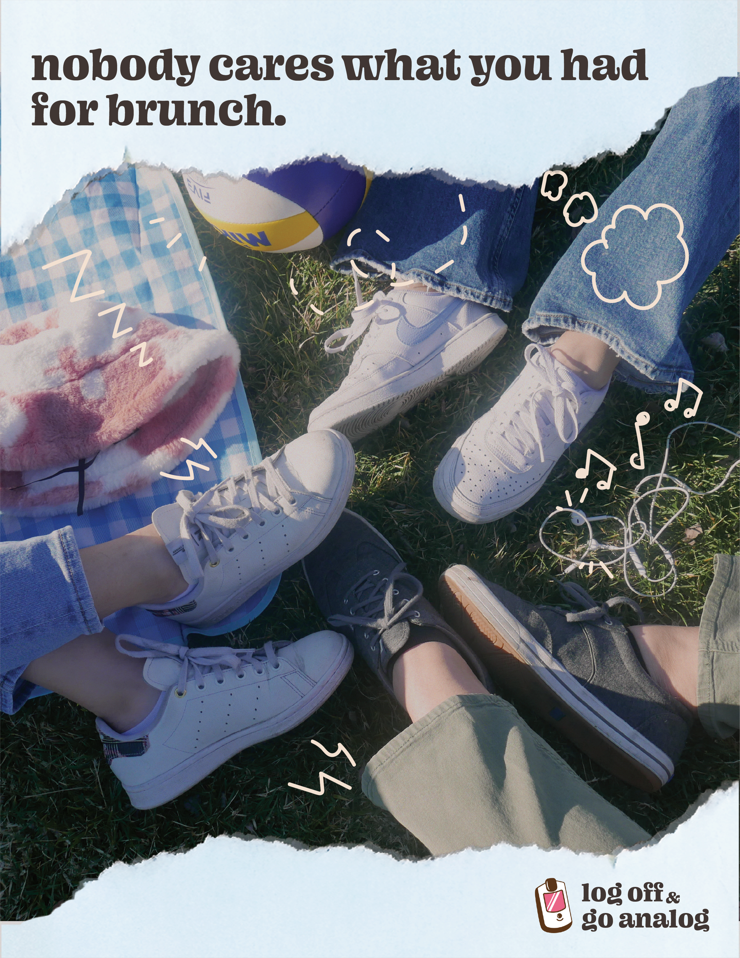
Imagery: All the photos I had were taken by smartphones. Thus, I gathered five of my friends together and had a (very casual) photoshoot in a nearby park. The photos ended up looking candid and natural, and they worked well for the website!


Illustrations
To drive home the “analog” feeling, I drew icons that looked purposefully freehanded, with rough lines, muted colors, and organic shapes.

Logo
I initially used the expanded logo for all my branding elements, but began to use the standalone icon (left) as both a logo as well as a character in stickers and other brand elements.


Website
Creating a website using my initial brand guidelines helped me find a solid direction for my brand, because I was able to see all elements working together on a large scale. This is where the majority of the changes to my brand guidelines occurred.
Social campaign
To spread the word about this campaign, I made flyers, stickers, and billboards rather than social media posts or profiles to keep the analog theme.
Although realistically a nonprofit like this would not use billboards as their main form of advertisement, I wanted to challenge myself, because I had never designed something at such a large scale that would be viewed for such a short amount of time.
Since my target audience was older gen-z and young millenials, I decided to shift to a more playful tone–both funny and thought-provoking, which is perfect for a billboard.
For my other campaign elements, I envision that flyers would be posted on bulletin boards in coffee shops, classrooms, and other public settings. analog could also either sell or hand out stickers as a fun way to spread the word about this message.


takeaways
Creating a brand does not have to be (and usually is not) a linear process. After creating this brand, as well as branding for other student organizations and school projects, I realize that it takes multiple tweaks and iterations for all the elements of a brand—typefaces, color palettes, logos, and icons—to work together cohesively. It’s enjoyable to see the brand evolve over time, and if one element looks out of place, all you have to do is change the brand guidelines!
I particularly enjoy brand design, because seeing every individual element work together to create something that resonates with others is so rewarding. I particularly enjoyed this project, since I had lots of creative freedom in making illustrations, taking my own photos, and using my logo in unique ways.


Credits
Design Instructor: Meg Quarton
Design: Abby Louie
Company: University of California, Davis
